July 26, 2004
Ms. Frizzle, meet Claude Shannon
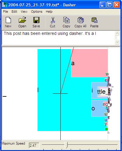
This post has been entered using Dasher. It's a little tricky, but with practice I could get good at this, I'm sure. Dasher is a really nice idea. I don't know what kind of uptake it's getting, but it deserves to succeed. It should be useful for people with various kinds of disabilities, and for people limited to tablet/stylus text input. Its developers have documented up to about 30 wpm with a mouse, and 25 wpm with an eyetracker. With some refinement and practice, it might even turn out to be better than typing.
Well, maybe not. Anyhow, I've stopped using Dasher and gone back to typing. But the idea of using dynamically recalculated probabilisitic autocompletion, based on an adaptable language model, is a terrific one. It's another nice idea to navigate though that space using up/down for the paradigmatic dimension and left/right for the syntagmatic one. And it's sheer Borgesian genius to describe the concept this way:
Imagine a library containing all possible books, ordered alphabetically on a single shelf. Books in which the first letter is "a" are at the left hand side. Books in which the first letter is "z" are at the right. ... The first book in the "a" section reads "aaaaaaaaaaaa..."; somewhere to its right are books that start "all good things must come to an end..."; a tiny bit further to the right are books that start "all good things must come to an enema...".
When someone writes a piece of text, their choice of the text string can be viewed as a choice of a book from this library of all books - the book that contains exactly the chosen text. ...
By looking ever more closely at the shelf, the writer can find the book containing the text he wishes to write. Thus writing can be described as zooming in on an alphabetical library, steering as you go. ...
This is exactly how Dasher works, except for one crucial point: we alter the SIZE of the shelf space devoted to each book in proportion to the probability of the corresponding text.
 But
couldn't they do better with the presentation? The colors vary among shades
of yellow, green, pink and blue, plus black and white, kind of like a 1950s
motel lobby. And the space is represented using unattractive overlapping rectangles
that don't give me any sense of an inhabitable landscape.
But
couldn't they do better with the presentation? The colors vary among shades
of yellow, green, pink and blue, plus black and white, kind of like a 1950s
motel lobby. And the space is represented using unattractive overlapping rectangles
that don't give me any sense of an inhabitable landscape.
Compare the base26 interactive visualization (due to toxi) of the space of four-letter English words that I discussed here. That visualization is limited to one serial position in the simple and static universe of four-letter words, with no practical application in view, but it gives a sense of a space that you could sail around in, and (perhaps for the same reason) it's interesting to watch and to interact with, even though it's not good for anything. Using Dasher, or watching someone use it, doesn't convey much of the sense of the organic form of the word space that toxi's visualization does. At least not to me.
The "base26" style of visualization presumably uses a lot more graphics processing, but that shouldn't be an insuperable barrier as time passes. I certainly don't mean that the base26 mode of mapping the word space could or should be adopted exactly and in detail, and I certainly haven't thought through the problem of adapting that style of representation to a Dasher style of interaction. But I think it would be neat to maneuver through a base26 type of space with a Dasher type of control, kind of like The Magic Schoolbus meets Claude Shannon.
Really, it'd be great to have Ms. Frizzle at my side as I write... "take chances! make mistakes! get messy!" But I digress.
There's no daring and no messiness in the WORDCOUNT application by Jonathan Harris from FABRICA, the "Benetton Research and development Communication Centre" in Treviso, Italy. It's presented as "an artistic experiment in the way we use language", based on a frequency list of words from the British National Corpus. Maybe I'm being dense, but this experiment doesn't do anything for me. It lacks Dasher's ugly colors and shapes, but nothing about it seems visually memorable or interesting. The description calls it "minimalist", but sometimes that's just a word for "dull". As for the content, WORDCOUNT doesn't seem to show anything beyond what a simple textual frequency list shows. In contrast, base26 really seems to present something about the informational structure of the orthographic word space that isn't trivially equivalent to a simple list of words and counts.
[link to WORDCOUNT from Abnu at Wordlab]
Posted by Mark Liberman at July 26, 2004 12:00 AM