April 27, 2005
"This was a total embellishment"
 It's not just copywriters. Graphic designers could use a bit of fundamental education in linguistics, too. Mark Swofford at Pinyin News takes a swipe at Chris Calori and David Vanden-Eynden, for the quotes attributed to them in an April 12 article in Metropolis Magazine, under the headline Graphics That Bridge a Linguistic Divide.
I'll refer you to Mark's post for the critique, and here just let Calori and Vanden-Eynden misspeak for themselves. First, their take on Chinese characters as "ideas":
The Chinese language has more than twenty thousand characters in common usage, and they function in fundamentally different ways than Western letters. “Each character is really an idea,” Calori says. “They’re called ideograms. The Chinese can say in four characters what it might take us a paragraph to describe.”
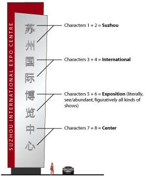
Then the really fun part, their analysis of the Chinese text of the sign whose design they're explaining (苏州国际博览中心 Sūzhōu guójì bólǎn zhōngxīn = “Suzhou International Exposition Centre”). I especially like the part (at the end) about how "this was a total embellishment" and "they wanted the warm, fuzzy heart center, as opposed to the cold, hard center of hell".
“Historically, Suzhou was known for its gardens and greenery,” Vanden-Eynden says. “So the top particle of the first character means ‘grass.’ The second character translates roughly to ‘green state.’
“The next two characters combine to create International. The third character stands for ‘nation;’ the big box around it is ‘mouth’ or ‘center.’ The strokes inside of the box denote ‘jade,’ which is highly prized. The fourth character represents ‘border’--but one part also symbolizes ‘the ear,’ another part ‘to demonstrate.’ So, literally translated, you’re demonstrating that you’re the prize or the center or the mouth.
“How do you describe an Expo? It’s a notion. We shortened it, because ‘exposition’ was too damn long. So what takes place at an expo? Well, a bunch of people and companies get together in one spot to show each other new products and ideas. That’s a lot to describe in one word. The Chinese manage to do it in two characters, which stand for ‘abundant’ and ‘view.’ The top part of the fifth character is ‘noting like it’ or ‘of itself’ (the cross doesn’t have a lot of significance); the second part means ‘subsidiary,’ and the bottom is the unit name for the Chinese inch, which implies a multitude of something. The sixth character is ‘to look’ or ‘view.’ So, an abundant-amount-of-things-to-look at equals expo.”
“The last two characters for Centre--it’s interesting they went with the British spelling--are actually redundant,” Calori says. “Often you see the seventh character--it means ‘middle’--for center. But the client also added the eighth character, which is the symbol of ‘heart.’ The heart is the middle, so they reinforce each other. This was a total embellishment.” Adds Vanden-Eynden: “They wanted the warm, fuzzy heart center, as opposed to the cold, hard center of hell.”
There are more than a few grains of truth in there, but they're embedded in a dense matrix of confusion. I can't resist quoting Mark's comment on the "total embellishment" of the "warm, fuzzy heart center":
This is so wrongheaded and absurd it’s hard to know whether to laugh or cry. The client didn’t add the eighth character (心). It’s used in writing the word for “center,” which is zhōngxīn (中心). The only thing “fuzzy” here is the thinking behind this nonsense.
Posted by Mark Liberman at April 27, 2005 07:57 AM