October 15, 2006
More on pitch and time intervals in speech
 This is W.H. Auden, reading the first two lines of his villanelle "If I Could Tell You":
Time will say nothing but I told you so,
Time only knows the price we have to pay;
The picture shows the dipole statistics of pitch intervals in his voice. What does it mean? I'm not sure whether it means anything at all, but I thought it was a pretty picture, and it's part of an interesting exploration, so I'll share it with you.
This all started because I was curious about a paper by Maartje Schreuder and others, arguing that there are musical intervals implicit in the pitch contours of spoken Dutch (and other languages), which relate to the expression of emotions in the same way that such intervals do in music ("Poem in the key of what", 10/9/2006). I expressed some skepticism about the role of musical intervals (i.e. small-integer pitch ratios) in speech, but I was intrigued by the appearance of clear modes in the distribution of pitches in (at least some) spoken phrases. I suggested that "dipole statistics" might be an interesting way to look at distributions of intervals in speech, without requiring the segmentation of speech into "notes" -- and this picture is one of the first fruits of such an exploration. The details are below.
First, some background. The idea of looking at the pitch patterns of speech in musical terms is an old one. Until fairly recently, people explored this area by ear. For example, in 1775, Joshua Steele published Prosodia Rationalis: An Essay towards Establishing the Melody and Measure of Speech to be Expressed and Perpetuated by Peculiar Symbols, in which he tried to work out spoken pitch contours by removing the frets from his viola da gamba, imitating the vocal patterns on the instrument, and then transcribing the results.
These days, we can use computer programs to estimate the local periodicity of the voice, and plot the results as a "pitch track", in which the usual convention is to plot time from left to right, and fundamental frequency (often symbolized as F0) from bottom to top, in the same geometry as a musical staff. Here's a pitch track for the two lines of Auden quoted above. This is Auden himself reading the poem, and an audio clip is linked to the picture:
(This particular pitch track was calculated by a program originally written by David Talkin (now at Google) when he was at Bell Labs, based on an algorithm proposed by George Doddington when he was at Texas Instruments, and integrated into a free-software program called WaveSurfer created by Kåre Sjölander and Jonas Beskow at the Royal Institute of Technology in Sweden. It's one of the better pitch-trackers out there, though you have to realize that the pitch-tracking problem is difficult to solve well, and impossible to solve completely.)
The pitch track itself is of course a long list of numerical estimates, typically calculated a hundred times per second. For example, the numbers behind the plot above start out this way:
377.524475098 146.773223877 811.74230957 141.53427124 1352.58544922 144.847839355 1881.64099121 142.978637695 1937.74511719 143.269439697 2044.27075195 146.828552246 2099.38745117 150.982391357 1904.56750488 161.24609375 1822.4486084 165.136077881 1727.72424316 167.19380188 1704.8605957
The first row (where the pitch is labelled "N/A" for "not available") is the last of the series of centisecond frames where there isn't any voiced speech, and then we get into ten frames that track the pitch across the first tenth of a second of the beginning of Auden's pronunciation of the syllable "time". The F0 estimates aren't nearly as accurate as the displayed number of decimal places might suggest -- that's just what the program produces as decimal representations of its internal numbers. In a case like this, different plausible choices in the estimation process would give us slightly different values, and I'd guess (without trying it in this case) that there are by that criterion three or four significant figures here.
Once we have the pitch track, there are many different ways to reduce this long list of numerical values to a form that lets us talk about pitch values or ranges or intervals as properties of vowels, syllables, words or phrases. One traditional method is to pick peaks and valleys -- local maxima and minima of the contour -- while trying to avoid being fooled by occasional scattered points that lie outside the smoothly-varying range (or by the common octave errors in estimation). Another method is to divide the speech into phonetic segments, corresponding to consonant closures, open portions of vowels, and so on, and to derive characteristic values for these segments in some way -- the mean, or the median, or the maximum and minimum, or the median of the middle third, or various other percentiles, or some sort of amplitude-weighted measure. Other methods schematize the contour by fitting more sophisticated models of one sort or another (e.g. TiLT or Stem-ML or MOMEL/INTSINT).
If there were indeed musical intervals somehow involved -- as is undoubtedly the case in a capella singing -- none of these methods would necessarily bring those intervals out in a clear way. And the idea of looking at modes in the histogram of F0 estimates, used by Schreuder et al., is a cute one. It doesn't require any linguistic segmentation, it's relatively robust to occasional estimation errors, its structure can be related straightforwardly back to the original estimated pitch values, it's easy to compute. And such histograms, especially if we limit our attention to one or two spoken phrases at a time, seem to have quite a bit of structure. Here's the pitch histogram for the same two Auden phrases:
But what this structure really is, and what it means, is far from clear. The usual story would be: the modes in the histogram are relatively uninteresting artifacts, a simple consequence of the fact that pitch contours often involve fairly smooth peaks and valleys, whose relative pitch-values are part of the intonational pattern, but are not in any sense musical tones or musical intervals (i.e. pitch-classes related by a system of small-integer ratios). Another story -- the one that Schreuder et al. tell -- says that the modes are in fact symptoms of a pitch-interval system that functions in speech just as it does in music.
Although it's easy to calculate pitch histograms for spoken phrases, this doesn't directly address the question of what intervals (musical or otherwise) might be involved. So we might want to look at the distribution of intervals instead. But this raises the question of time -- which pairs of time-points should be compared?
The simplest answer would be to look at all time-relationships. Thus if we have six seconds of speech, with 600 pitch estimates, we would compare every estimate to all 599 other estimates, yielding 200*199 = 359,400 intervals to be counted up. But maybe temporally remote intervals don't really matter much -- in the case of the Auden lines we've been looking at, do we care that the pitch interval between a point in the middle of "will" and one at the end of "price", 4.394 seconds later, is 1.47? What about relations between the start of the poem and the end, a couple of minutes later? And maybe too-near intervals shouldn't be counted in the same way either -- do we care that we can find that same pitch ratio of 1.47 within the rapidly-rising pitch of the single syllable "time"? At least, it seems that we risk counting up apples and oranges in the same histogram bins.
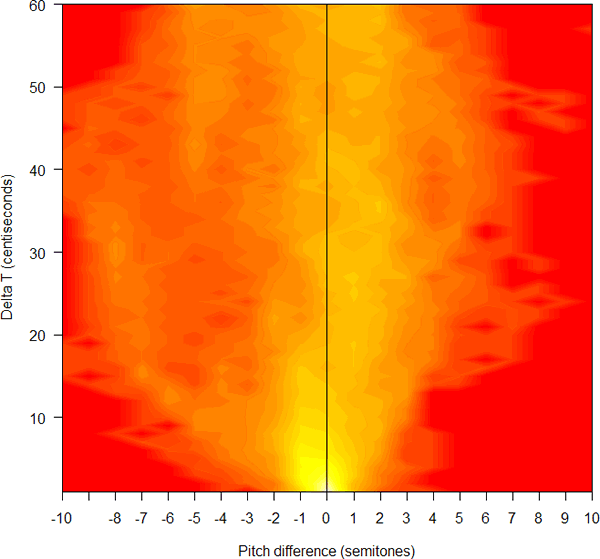
One obvious alternative, at least for the purposes of exploratory data analysis, is simply to add the time difference as an additional dimension. Thus we'll look at all the pairs of pitch-values that are X centiseconds apart, for X={1,2,3, ..., N}, up to whatever time-span we think might be relevant, and make a separate histogram of pitch intervals for each time interval. Then we can plot the results with time differences on one axis, and pitch differences on the other axis, and some false-color representation of the count at each pixel. (This is related to concepts such as Buffon's Needle, and more closely to the idea of dipole statistics as a way of characterizing image textures, originally developed 45 years ago by my old neighbor at Bell Labs, Bela Julesz).
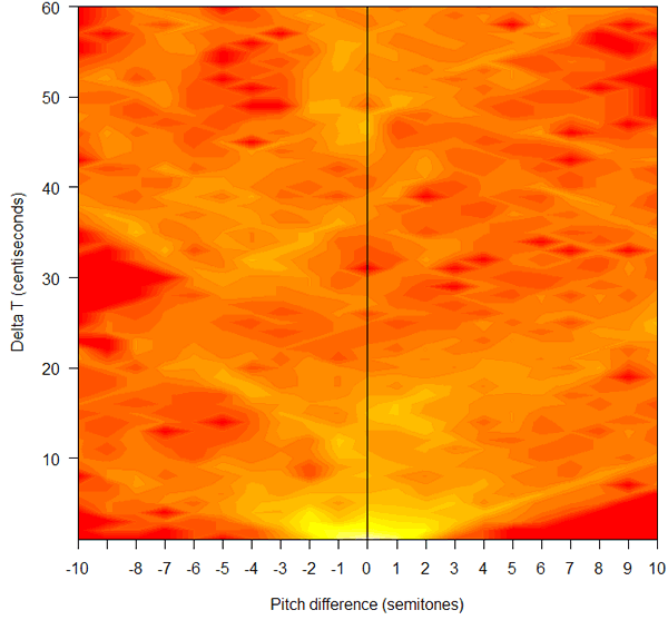
So I wrote a little R function to do this, using R's filled.contour( ) function to plot the resulting two-dimensional histogram. And this is what the result looks like for the two lines of Auden:
Note that in this plot negative pitch differences represent higher-to-lower pitch intervals -- thus the point at [-3, 12] represents the count of pitch-estimates 0.120 seconds apart where the second estimate is 3 tempered semitones lower than the first one (i.e. the two estimates are roughly in the ratio of 1.189 to 1). Hotter pixel values represent higher counts. Also, because the counts trail off very rapidly away from the maximum at [0,0], I've plotted the counts to the power of 0.33, so as to bring out the structure in the lower-count regions.
What does this mean? Like I said, I don't really know. The fact that there are a lot more falling counts than rising counts (i.e. more counts to the left of the midline than to the right -- 7908 vs. 2925, if we look at time intervals up to 80 centiseconds) is obviously related to the general pitch downtrends that are apparent in the pitch contour. The structures trending diagonally upwards and to the left, and diagonally upwards and to the right, obviously reflect the average rates of short-term fall and short-term rise, respectively. But these are things that we can see in the original pitch contour -- their reflection in this two-dimensional histogram of intervals is pretty to look at, but so far it's not bringing any additional insight, as far as I can tell.
At least it's true that different pitch patterns show up as different-looking patterns in plots of this kind. Thus if we compare the Auden clip to three other more-or-less-random selections of similar length, recycled from earlier Language Log posts, we see this:
|
 |
 |
|
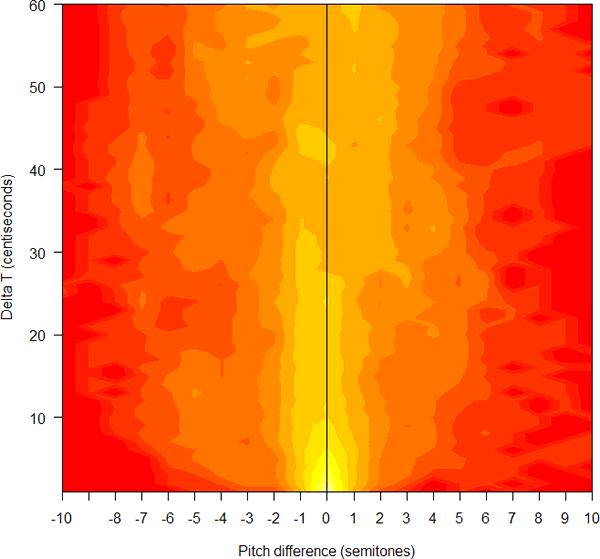
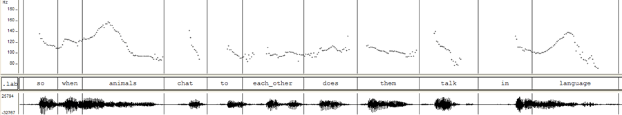
The first comparison is with a phrase from Ali G's interview with Noam Chomsky. ("Ali G in the land of colorless green ideas", 4/21/2006). Ali asks: "So when animals chat to each other, does them talk in language?" Here's the pitch contour (audio clip linked as usual):
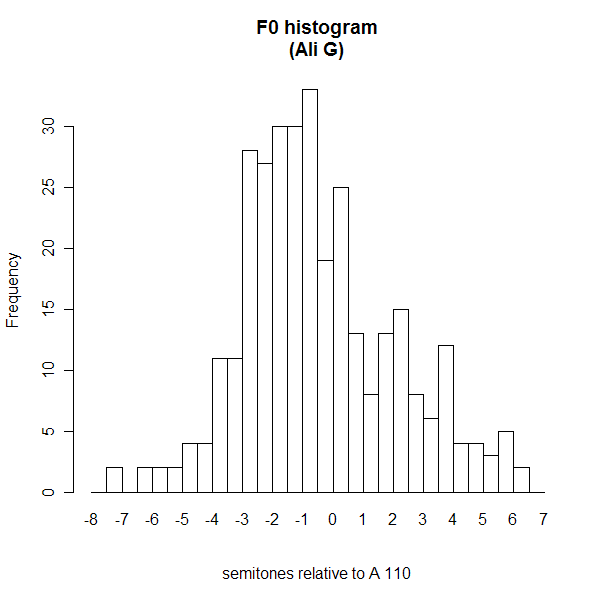
Here's the pitch histogram:
And here's the plot of time- and pitch-intervals:
Note the larger amount of stuff to the right of the midline (7018 vs. 7317 counts), corresponding to the greater role of short-term pitch rises instead of falls.
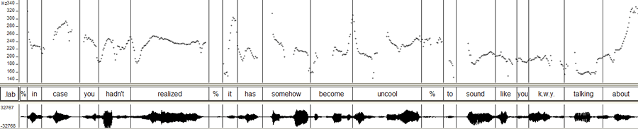
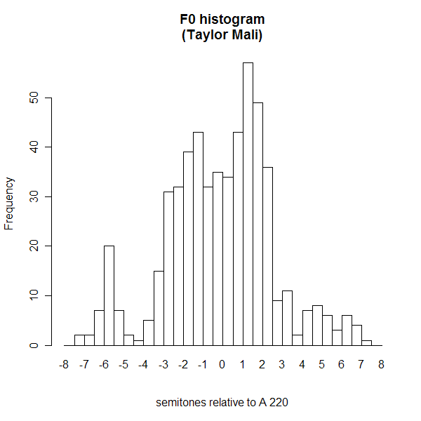
The second comparison is to Taylor Mali reading the first few phrases of his poem "Totally like Whatever" ("This is, like, such total crap?", 5/15/2005)
In case you hadn't realized,
it has somehow become uncool
to sound like you know what you're talking about?
Here's the pitch contour:
Here's the pitch histogram:
And here's the time/pitch-interval plot:
One thing that the time/pitch-interval plot brings out -- though it's also visible in the basic pitch contour -- is that Mali's performance is actually dominated by long stretches of relatively level pitches, both phrase-medial and phrase-final, rather than by the occasional low-to-high final rises that he also uses. You can see that by the relatively large number of counts at pitch-intervals near zero and time-intervals from 1 to 40 centiseconds or so.
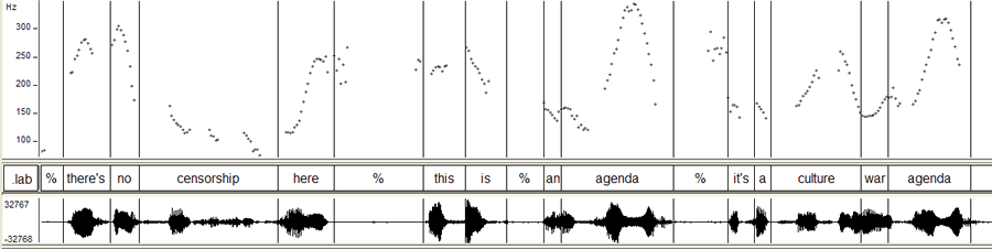
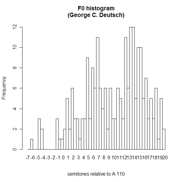
The third comparison is to a couple of phrases from another angry guy, George C. Deutch ("Angry rises", 2/11/2006). Mr. Deutsch was a political appointee at NASA, who lost his job after allegedly trying to suppress reports of global warming. This is from the peroration of an interview with a Texas radio station, and his emotions are running high, at least judging from the sound:
There's no censorship here! This is -- an agenda! It's a culture war agenda! They're out to get Republicans, they're out to get Christians, they're out to get people who are {breath} helping Bush; anybody they perceive as not sharing their agenda, they're out to get!
Here's the pitch contour for the first three phrases:
Here's the pitch histogram:
And here's the time/pitch-interval plot:
Like the original pitch contour, this shows us that Mr. Deutsch's pitches are rising and falling rapidly and frequently, across wide ranges of pitch values, expressing his soul's agitation.
Do these various time/pitch-interval plots compel belief in a musical system of pitch classes related by small-integer ratios? Not so far. Do they provide other novel insights into English intonation in general, or into the pitch patterns of the four short segments that we've examined in particular? Not so far. They're kind of pretty to look at, though.
[Here's the R script I used to create the Auden picture:
F1 <- getf0("IfICouldTellYou1.f0")
sF1 <- h2st(F1,110)
sD1 <- dipole3(sF1[1:600], 0.5)
filled.contour(1:21,1:60,sD1[3:23,1:60]^(.33),color=heat.colors,
   ylab="Delta T (centiseconds)",
   xlab="Pitch difference (semitones)",
   plot.axes={ axis(1, at=1:21, labels=(-10:10)); axis(2);         points(c(11,11),c(0,60),type="l") }
 )
The extra functions used (like getf0 and h2st) can be found here. ]
Posted by Mark Liberman at October 15, 2006 09:13 AM