November 11, 2005
Stereotypography
 On her Abecedaria
blog, Suzanne E. McCarthy draws our attention to the title of a new
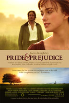
film adapting Jane Austen's most famous work: Pride & Prejudice. One can
interpret the ampersand as a visual indicator of the movie's high-spirited take on the Austen novel, though McCarthy notes that many
in the media have simply represented the title as Pride and Prejudice. She suggests
that those typing or editing copy may be "making a grammar
correction along the lines of 'In this context the ampersand really
should not be used.'" Yet another editorial "correction"
that turns out to be not so correct.
This isn't the first Austen adaptation to deploy an ampersand. Just last year there was Bride & Prejudice, a Bollywood-style reimagining of the novel set mostly in Amritsar, India. The use of the ampersand, along with the punning change of Pride to Bride, let viewers know that this was no ordinary adaptation. The same could be said for Baz Luhrmann's stylish 1996 film, Romeo + Juliet, which moved the action of Shakespeare's play to "Verona Beach" in contemporary southern California. For Luhrmann, an ampersand wasn't sufficient; only the ultramodern plus sign would do the trick.
So far, critical appraisal of the ampersand in Pride & Prejudice has been mixed. On Slate, David Edelstein calls the ampersand one of the "ominous first impressions" that he had to get over in order to like the movie. The Toronto Globe and Mail (or is it "Globe & Mail"?) says the ampersand signals a "contracted, contemporary approach" to the novel. The San Francisco Chronicle finds the typographical choice to be indicative of the movie's "jaunty approach." And the Detroit Free Press says "the only thing really new" in the film is "the hip ampersand of the title."
Contemporary! Jaunty! Hip! That's a lot of stereotypical baggage to put on a modest piece of punctuation that has been kicking around in one form or another for about two thousand years.
[Update #1: Duane Dudek of the Milwaukee Journal Sentinel picked up on the recent cinematic trend of using the ampersand, as in this summer's Hustle & Flow, Kicking & Screaming, and Mr. & Mrs. Smith. The choice by filmmakers is an aesthetic one, based on connotations of hipness and modernity (despite the typographic element's long history back to Roman times). Graphic artists trace the origin of the ampersand as a "modern" design element to the art director Herb Lubalin, known for his work on Avant Garde magazine and the journal U&lc (not U&L, as the Journal Sentinel has it), which stands for 'upper and lower case.' Dudek further notes that marketers looking for a "cutting-edge" visual approach see the ampersand as a way of attracting a younger, technologically savvy demographic, who know it from messaging/texting shorthand.]
[Update #2: Suzanne McCarthy has more on Abecedaria about the typographic details of the italic ampersand used in Pride & Prejudice advertising. She also takes a look at the connector in Romeo + Juliet, which appears as more of a cross than a plus sign in the movie poster.]
[Update #3: Several readers email to question the idea of the ampersand as a signifier of hip modernity. Carrie Shanafelt notes that the ampersand was actually quite common in the typography of Jane Austen's era, though it was largely restricted to use as a symbol for Latin et. Richard Mason detects a "retro air" in ampersand usage, pointing to "the old-timey flavor" of Smith & Company as compared to its more modern equivalents, Smith, Inc., Smith LLC, and smith.com. (See Mason's blog for further comments.) Clearly what is old is new again.]
Posted by Benjamin Zimmer at November 11, 2005 02:17 PM