October 17, 2006
Ask Language Log: dotless in Georgia
Matthew Stuckwisch asks
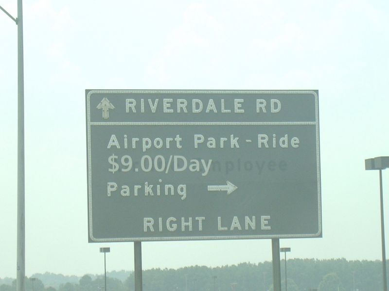
I'm a frequent reader of Language Log and figured this particular thing I started noticing in Georgia would interest you. More and more when I drive through to Atlanta, road signs no longer say, for instance, "Marietta", rather "Marıetta". It seems that the newer signs have begun to substitute <ı> for <i> across the board. However, I've never seen the dotless-i in English otherwise. Is there a progression that I don't know about to get rid of the dot, or is it some odd thing that Georgia is doing? It's definitely not just one or two signs whose dots have fallen off, it's common enough that it has to be a style issue.
Pending a response from the Georgia DOT about whether they have a new policy to go DOTless, I certainly can't offer any authoritative comment. However, Turkish (and some other Turkic languages) have both dotted and dotless upper- and lower-case i; some typophiles apparently prefer dotless i in some contexts; and there are some corporate logos that use dotless i, e.g.

So perhaps some highway signage authority might have decided to go with a font whose i's are dotless?
If you have any more information on this possible trend, let me know.
[Update -- Jon Peltier suggests an economical or perhaps ecological motivation:
In one of the Paul Bunyan type stories I recall from childhood, the accountant for the lumberyard learned to stop dotting his i's and crossing his t's, in order to save gallons of ink. He wrote large, apparently.
And Joe Stynes points out an Irish connection:
In the 1940s, Irish spelling was simplified and the uncial script font used thitherto was replaced with modern Latin typefaces. One proposal was to replace i with ı, to contrast better with í. This was not implemented for printed matter, but more recently (perhaps in the last 20 years), it has come into use on bilingual roadsigns, where title-case Irish names are displayed above upper-case English ones. I don't know if this is a revival of the 1940s proposal or part of a global dotless-signage trend.
]
[Update #2 -- Michael B. Klein wrote:
I think I've found where Georgia is sending all those surplus dots -- they deliver them to The New Yorker and The Economist magazines, where they're used to create superfluous diaereses in words like "coöperate," "reënactment," and "preëxisting."
My own suspicion is that surplus road-sign dots are being recycled into heavy-metal umlauts -- surely The New Yorker and The Economist use only the finest European cold-pressed virgin diaereses? <Sub-update -- Lane Greene points out something that I should have noted myself, namely that "The Economist doesn't use the dieresis, the heavy-metal umlaut or any other kind of two-dot marker, except in German names with umlauts. To seperate doubled letters belonging to different morphemes and looking bad next to each other, we use hyphens: re-election, book-keeping, co-operation, etc." But I'm sure that if The Economist *did* use diaereses, they would use only the finest quality dots -- though perhaps with some recycled content to help preserve the environment.>
Meanwhile, Dick Margulis has taken action:
I posted a link to your post over on comp.fonts and alt.binaries.fonts. I know there is a recently released highway signage font that resulted from several years of research on legibility under driving conditions; I do not know whether that font is dotless, nor do I know whether it has been adopted by Georgia. But someone in one of those two news groups will know the answer to that and should write to you about it at some point in the next day or so.
So I took action, too -- I asked Google about {highway signage font}, and learned that:
America's big green highway signs are about to become more legible. Type designer James Montalbano announces that after years of development, the US Federal Government has finally given official interim approval for his Clearview to be used on all Federal roads.. The ClearviewHwy site covers some of the extensive research Montalbano has presented at various type conferences.
However, the samples presented on the cited page are not dotless:
and thus we'll need to find another explanation for any errant dots in Atlanta.]
[Update #3 -- two new theories. Angela Tompkins thinks that the (alleged) Georgia sign-makers have started using ligatures:
The dotless i is what is known in typography as a ligature. They are used where a combination of letters would be less legible without them (most commonly fi, fl, ffi and ffl). The letter forms are replaced with one form designed to work together better, reworked in the area where the glyphs interfere with each other.
The ri ligature is somewhat uncommon compared to the ones mentioned above, and I would need to see more examples of signs to know for sure, but this might be an answer to what is going on in Georgia.
But Matthew Feinstein writes:
I searched Google images with 'Georgia Highway Signage' and found the attached image. It suggests that there's a problem in Georgia that goes beyond dotting the i's.
I believe that Matthew is suggesting that Georgia sign-makers are somewhat randomly mixing upper and lower-case letters. If so, that would explain a rash of dotless i's -- they're not dotless, they're majuscule.
I hope it turns out that actual dotless-i signs are actually spreading in the Atlanta area -- the least interesting explanation would be that someone made a random local mistake, or a random local stylistic choice.]
[Update #4 -- Slibib Bibils writes
More trıvıa: the band Spinal Tap sports a dotless i. Georgian sign font could be an homage.
Of course, they did make up for the missing i-dot with a heavy-metal umlaut over the n:

And Charles Martin has a (very plausible) materialistic explanation:
I suspect there's an even easier explanation for the "dotless i' issue: those signs are basically made with retroreflective tape. The letter standard (http://en.wikipedia.org/wiki/FHWA_Series_fonts) includes dots ... but little dots, which have comparatively much edge to total adhesive surface, tend to peel off easily. So what they're seeing are very probably signs that have just lost their dots.
This wouldn't explain why there should be a cluster of cases around Atlanta -- but of course our evidence for that clustering is not exactly compelling, so far. And if the cluster really exists, I guess that the Atlanta sign-makers might have gotten a shipment of marginal tape, or something like that.
Finally, Peter Metcalfe observes: "I'm impressed at all this research over an iota of difference..."
We can't compete with the energy that went into the argument between ὁμοούσιος and ὁμοιούσιος, back in the fourth century. But these days, where else but in the blogosphere can you hope to find so much informed speculation about such a small point? At least, it'll turn out to a small point if there's a pattern of Atlanta-area facts to explain in the first place. Otherwise, I guess, it's a purely spiritual exercise.]
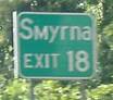
[I thought we were done here, but all the way from Perth, Western Australia, Robert Corr writes in with some actual evidence about the typography of road signs in Georgia:
You might be interested in this site, which includes a great many pictures of Georgia's roads and road signs:
http://www.gribblenation.com/gapics/gallery/
Most of the photos are several years old, but some are from May 2006. My quick squiz didn't reveal any shortage of dots.
But the dotless i's are in there! Here's one:
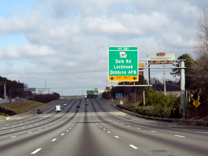
And here's another:
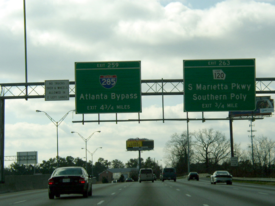
And a third:
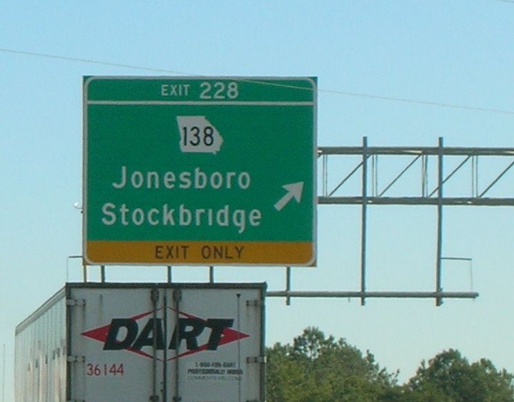
And here's one where we can see the dots in the very process of starting to wander off:
All from the Atlanta area! Ain't the internets wonderful?]
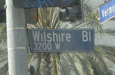
[Update 10/20/2006 -- Eric Vinyl writes:
Almost all the street name signs in L.A. have dotless Is. With the abundance of Spanish toponyms, I thought I would have noticed whether or not the lowercase Js in the City of Los Angeles are dotless as well, but I have not. Perhaps an astute Angelino can inform.
A Google query turns up some pictures and discussion (from astute L.A. residents) here. Example of "[t]he modern, dot-less street name sign. The one in most common use today. Boasts the cool flair design, in which the edge of the street name sign is cut at an angle.":
More information is here. Meanwhile, should that be "Angelino" or "Angeleno"? Or are they different?]
[Update 10/21/2006 -- Paige Scandell (who may or may not be the same person as Eric Vinyl) explains
My bad. I ain’t from SoCal (and proudly not so!)
A cursory Google search (`los angeles angelino OR angeleno') does show that, indeed, the preferred spelling is Angeleno. The thing that threw me off is that it’s anglicized, the final syllables pronounced much the same way -ino would be in Spanish. I just assumed this was from angeleño, but googling `gentilicio los angeles' reveals this thread on Word Reference. It’s even in the DRAE (which lists angelino first as someone from Los Angeles, Biobio) and some Catalana who stayed in La-la Land for a minute confirms:
I lived in LA for a while and yes, "angeleno" (in English) was the common word, as "angelino" was for Spanish speakers.
I couldn’t say whether I picked that up from reading La Opinión or not. And, I should have been clear; it can be any astute Angelen@.
]
Posted by Mark Liberman at October 17, 2006 06:35 AM